Paperie Sheep

fresh & modern hand crafted stationery

Late to the party

HenryComment
I know it's really late (or too early?) to be talking about X'mas related items, but I just couldnt help but to share some lovely family X'mas cards I made for 2010. I included a picture of my chubby daughter and she made the cards looked sooo precious.

I actually loved the mosiac tile design so much that I had to print them in two different style: one in 2-colors, one in 1-color. Dont you think the single color version looked like digital snow flakes falling from the sky? I thought so!  


Not your typical purple and green

HenryComment
I absolutely love the the color combo this fun bride has picked out, it was not your typical purple and green color combo. The green is vibrant and screams HAPPY! I also love those little sunray/abstract floral patterns, super modern and chic! The design was very simple, which allowed the color to stand out even more.


Sweet Sabrina

HenryComment
Sweet Sabrina, what a perfect name for this entry! I created this wedding invitation for Sabrina, who is one sweet lady! She wanted something romantic yet a bit chic, so thought a light gray with a hint of lavender would be perfect opposite her theme color - purple.

I had a lot of fun trying to find a unique yet girly font for their names with Sabrina, it turned out perfect for her big day!


Love Bugs

Henry4 Comments
A bride and her fiance asked me to create wedding cake toppers for their upcoming wedding. She asked for a bug theme since their nickname for each other is "bug". She sent me a pic of a ladybug (below) and requested Jiminy Cricket for her fiance.


It was a very fun project, I love how they turned out :)

Ants Attack!

HenryComment

I cant think of another better card to make for a little boy's birthday card, these little ants will definitely bring lots of smile to the boy's face! (smiles from mom not likely)

Toguchi

Henry2 Comments
I was asked by Toguchi, an established financial advisor to create an appreciation card for his royal clients, he wanted something simple and professional, yet with a little bit of humor. RJ has mentioned to me that the majority of his clients are older female, so he has envisioned the card to have a feminine touch.


I like how simple and clean the card looked, it delivered the message loud and clear. I enjoyed this card so much that I might apply the same concept to deliever other messages!


I was told that the cards had good response from his clients!

Hello Sunshine

Henry1 Comment
I have been under the weather the last couple of weeks along with my almost 14 months old daughter with some flu-like symptons, it was almost impossible to even function normally, needless to say to feel good. I needed something to lift my spirits so I turned to card making for some much needed comfort. 

I love greeting cards that are simple in design, clear on the message, and festive on the color. I love having large blank spaces on the card, because I believe when the stock is beautifully made, it should be appreciated rather than covered up. I once heard, "If the paper itself is beautiful, don't ruin it with so-called design, let the paper speak for itself. If the paper is not good enough to stand alone, leave it." 

I couldn't have agreed more.


I always enjoyed being greeted with "Hello Sunshine!" by a friend or a cashier at the Trader Joe's, not only it is super cute, it is also very cheery to hear. It has never failed to put a smile on my face.


I liked it so much that I couldn't resist to make another one in warm red. I could probably make one (or two) in every color of the rainbow, but I ran out of materials.


Honey Bunny

HenryComment
love all the cute little nicknames parents give to their little ones! my little girl is too goofy to be called anything girly, so when a dear friend came to me for a baby card to give to her expecting friend, i thought about "honey bunny"


a fuzzy pink bunny with "honey bunny" in lilac would put a smile on any mom expecting a little girl to arrive!


Picnic themed 1st bday bash

Henry3 Comments
i was told, people nowadays dont send out real invitations for a birthday party anymore. 1st birthday party for a cutest girl with the chubbiest cheeks needs a real invitation! she had a watermelon swimsuit and a watermelon dress picked out by her aunties, so the theme was set on summer picnic pool party.


nothing screams picnic louder and clearer than red and white gingham tablecloth overlay with kraft paper, so i created the whole birthday package with them, including invitation, thank you cards and favor tags.


wrapped the classic red and white gingham fabric around a cardstock before layering the printed kraft cardstock.

doesnt it look just like a miniture picnic table?


"1 in a melon" is just perfect for the occasion!


same style watermelon took center stage again in the thank you cards, kept the design simple and focus on the watermelon keeping the gingham pattern out. 


favor tags made with kraft paper and a watermelon sticker, each of them was tied to a 16oz picnic drinking mason jar with a piece of red and white gingham fabric, it also serves as a name tag for the guests.


yellow and grey, LOVE LOVE LOVE

Henry2 Comments
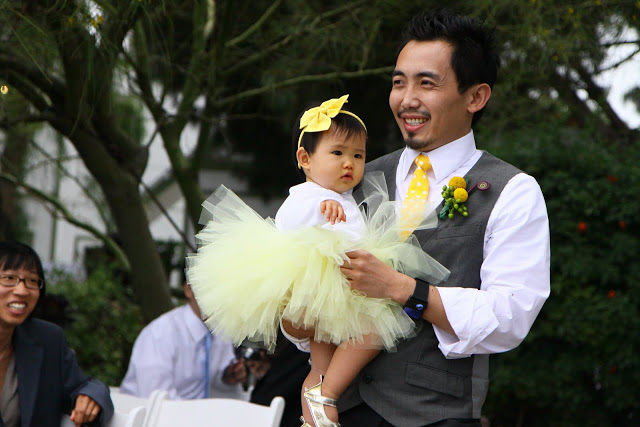
i absolutely love the color yellow, and when paired with grey, LOVE! so when it comes to my own wedding, no doubt yellow and grey will be the color (and white plus a touch of black).

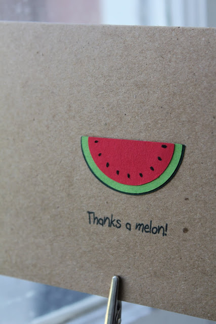
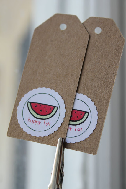
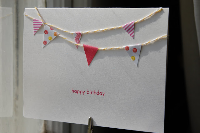
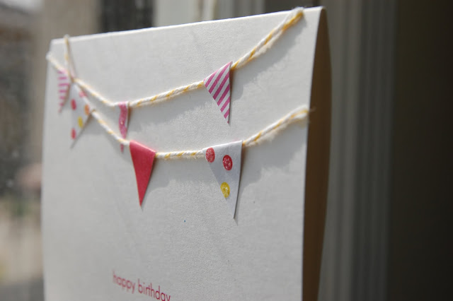
i loved all the little details we had at the wedding, because almost every little details were handmade!


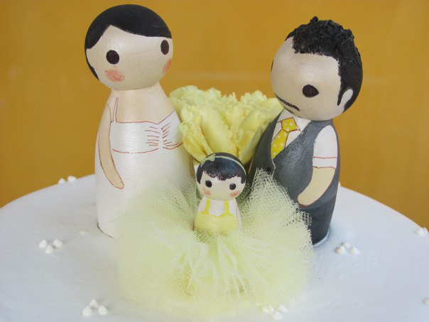
in this picture were my precious daughter and groom, she wore a yellow tutu that was hand tied by her mother. she was meant to be pulled down the aisle in a radio flyer wagon, but she refused to sit in it right before walking down the aisle, so her father held her in his arms.


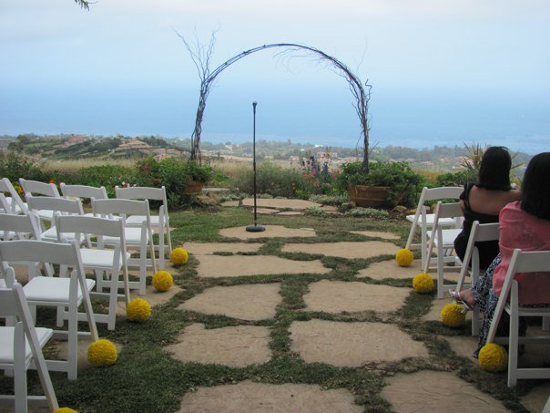
to keep the backdrop as the focal point, i kept the ceremony location simple, only tree branch arch at the alter and yellow pomanders next to the aisle.


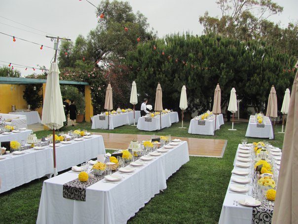
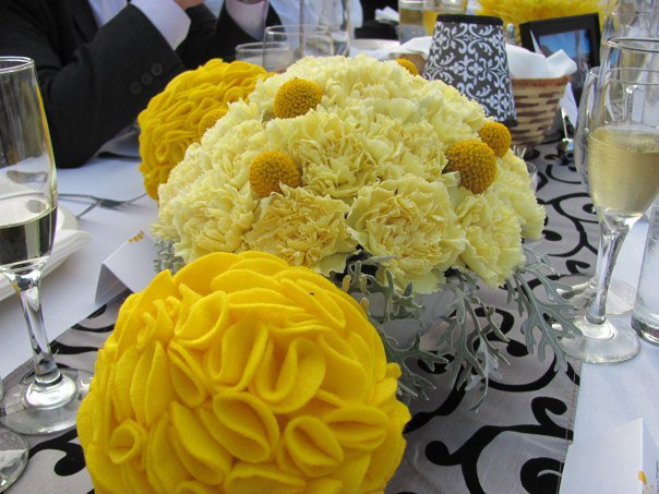
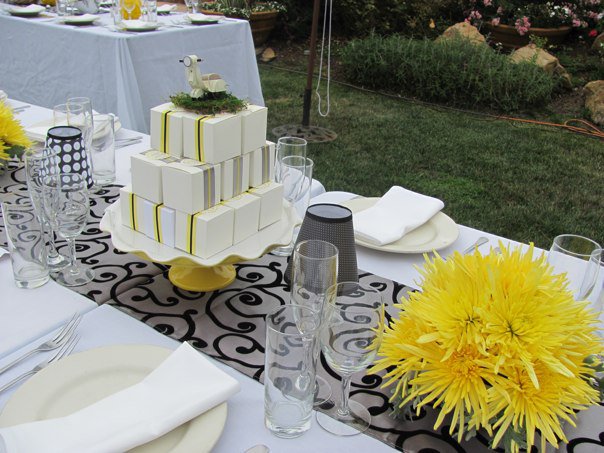
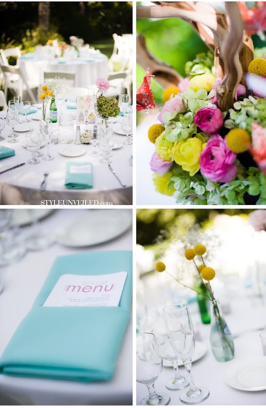
for the reception, we love long tables for the casual feel instead of the formal round tables. a handful of umbrella were placed to create more than just shade, but also a backyard outdoor dinner atmosphere. a grey table runner with black detail was strategically placed to pull all arrangements on the table together. all floral arrangements were in different shades of yellow, it stood out againt the darker grey and the white linen.


 i love mixing different materials, having all these rich yellow fabric pomanders was so much more fun than floral ones. i love seeing all the facial expressions on my guests' faces when they realized it was made with fabric. one most wowing fact about the pomander was, each petal was hand cut and hand pinned. 


other than floral arrangements and votive candles, wine glasses were turned into votive lamps when covered by lamp shades made with various patterned cardstock in black and white, the trims were heavily dusted with black coarse glitter. 


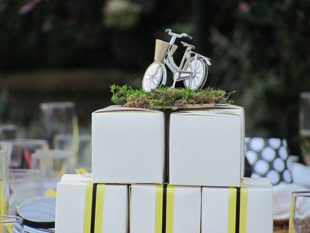
favors boxes were stacked into a cake tower, topped with a paper 3D model of objects corresponding to the table name were put together then placed on a bed of moss served as both a cake topper for the favor cake and table name.


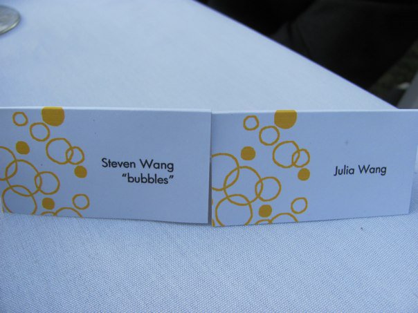
escort cards had simple organic bubble design, to reflect the celebration!


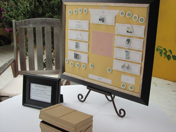
a framed table map with all the objects corresponding to the table names was displayed at the sign-in table, guests can easily identify which table they are being seated at. 


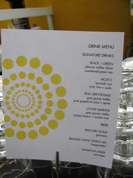
a handful of beverage menus were displayed around the bars and cocktail tables, i like the contrast between the bold and bright design and the small print.


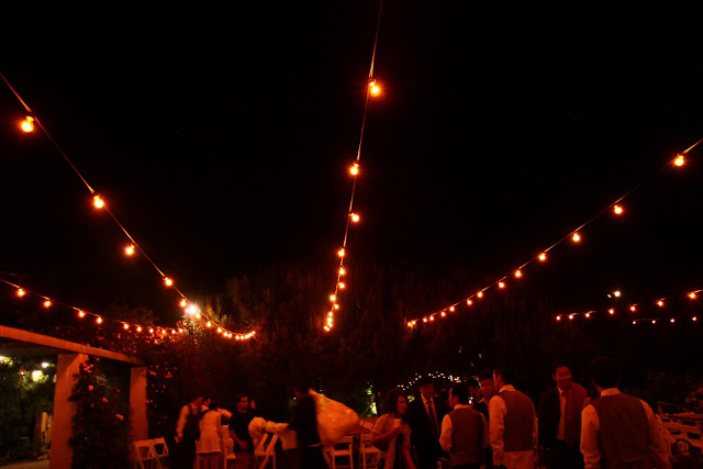
our must have for the reception - market bulbs! love love love the ambience it created, cozy and happy, reminded me of a backyard party in some small italian town :)

featured on style Unveiled!!!

Henry4 Comments
I got an email from Yuko { Yuko's Invitation and Thank You Card } saying her wedding was featured on Style Unveiled, and she has enlisted me as her stationery vendor!

It's too bad the menu was already tucked into the napkin so you cant see the whole thing. But it's still very lovely!


I love the letterpressed invitation. I wished the photographer had focused on the two birdies on the bottom of the invite, but i totally understand why it had to focus on yuko and greg's names.

I am very excited to be featured on another website!

chirp revealed!

Henry4 Comments
still remember the back view of two birds couple months back?


i had a chance to create a pair of love birds wedding cake toppers for joey and johnny a couple months ago, but i didnt want to reveal them until their wedding. they were looking for something cute and cuddly, so i made the birds a little chubbier than they have asked for.  


to give it a little personal touch, i made the groom a little chubbier than the bride, since johnny LOVES food. i put rosey cheeks on the bride to make her girlier to match sweet sweet joey.

i wanted johnny and joey to be able to display the birdies in their house after the wedding, so i made them a little bigger. they were almost as big as the first tier cake... 


isnt this such a cute picture?

(i was told these birdies were a big hit at the wedding!)

birthday celebration

Henry1 Comment
what could be better than to celebrate a birthday carnival style? a birthday card with carnival flags is just perfect for the occasion!


love the way those little flags in fun colors overlapped, so happy, so sweet and so festive! 

yuko - menu

HenryComment
with a limited budget for yuko and greg's reception menu, i did this simple yet cute menu for them. it was printed in color on a flat 4 x 7 heavy cardstock.  


i love the two birdies standing on top of the e and the n, very cute and lovey-dovey, just like yuko and greg :)


Mi Familia

Henry5 Comments
so glad to finally be done with my own wedding, it was so much harder than planning weddings for other brides! i never knew it would be as time consuming as it was... 

 before i have all the details organized, here is this a fun family portrait :) 


i had a lot of fun creating this family cake toppers, they came out so well! i couldnt decide which one i enjoyed more of making, henry or kammie, because i love henry's hair (both hair and facial hair) and kammie's tutu.

(i had no idea who decided to put a flower between henry and myself... it totally took the focus away from kammie's tutu)

chirp!

Henry1 Comment

i am really excited to post something unique today! i can only post the back view of these lovely friends because they havent not been seen by the public, they will not be debuted for couple more weeks in napa valley!

one may ask "why are these two being introduced on paperiesheep?"

believe it or not, THEY ARE MADE WITH PAPER :)

Karen

HenryComment

had a lot of fun working on this layer invitation with chandelier, the colors were sweet and romantic, just like the bride!


i love paper with texture, LOVE LOVE LOVE! it was quite a challenge to trim them to size and have the chandeliers on all pages to line up perfectly. 


the pages are as pretty on its own as layered.